Case #1
Improving the Conversion Rate in the NearVPN app
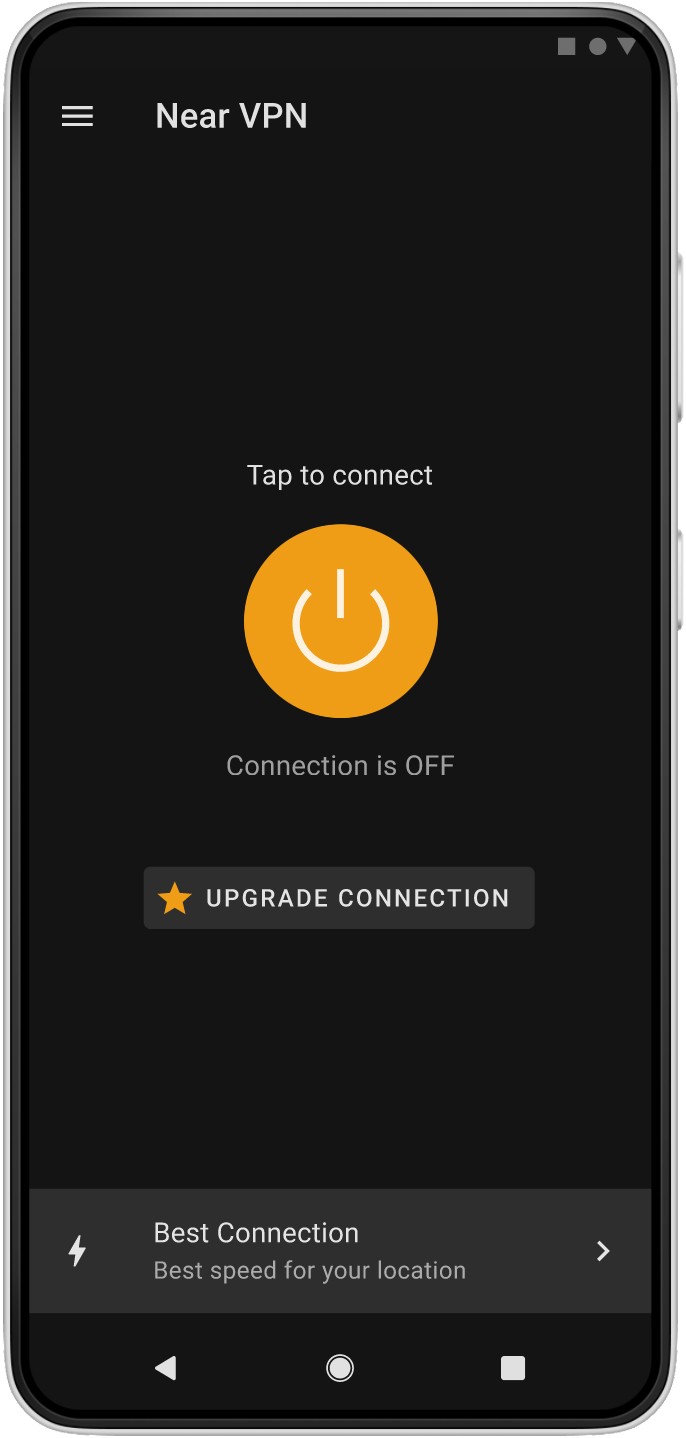
NearVPN is a cross-platform app for VPN connections. This case focuses on the Android version.
Inputs:
Low conversion rates to payment and average check,
Sufficient organic traffic in the store to test ideas one by one,
Limited development resources.
For More Details, Welcome to My Workshop 🛝 👷🏻♂️
Research
Analyze User Feedback and Inputs
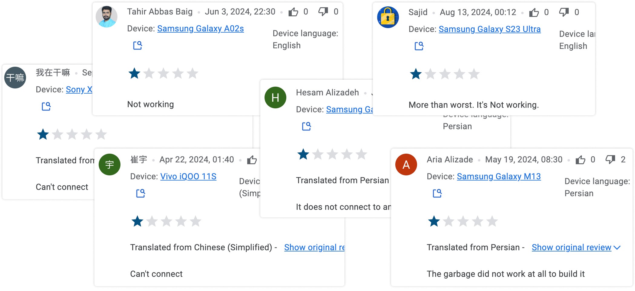
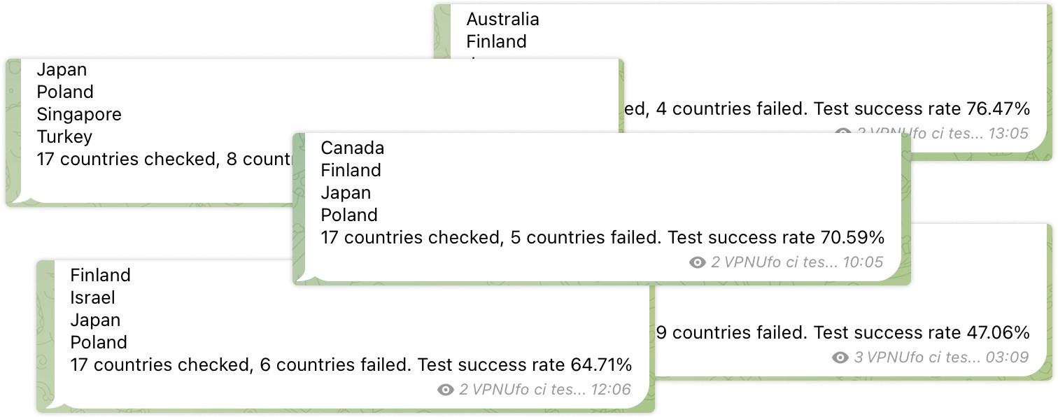
The app uses Material Design 2 to simplify development.
The app is designed for consumers without extensive technical requirements.
Privacy-Conscious Users
Secure encryption, anonymous browsing, protection on public Wi-Fi.
Remote Workers and Digital Nomads
Reliable, fast connections; access to region-restricted services; protection of sensitive corporate information.
Users in Censored or Restricted Areas
High anonymity, access to unrestricted regions, user-friendly interface.
Frequent Travelers
Protection on public Wi-Fi, access to home services securely while abroad.
Define the Product Value
Access to Global Content
Enable users to bypass geo-restrictions and censorship, providing access to global websites, streaming platforms, and services.
Speed and Performance
Provide fast, stable, and low-latency connections to ensure a seamless experience for streaming, gaming, and working remotely.
Privacy and Security
Protect user data and ensure anonymity through encryption and secure connections, even on public Wi-Fi networks.
To gain a better understanding of the competitive landscape, design patterns, functionality, and pricing, I conducted competitor research on several apps across mobile, desktop, and Chrome extensions, including one professional-grade VPN services for corporate users.
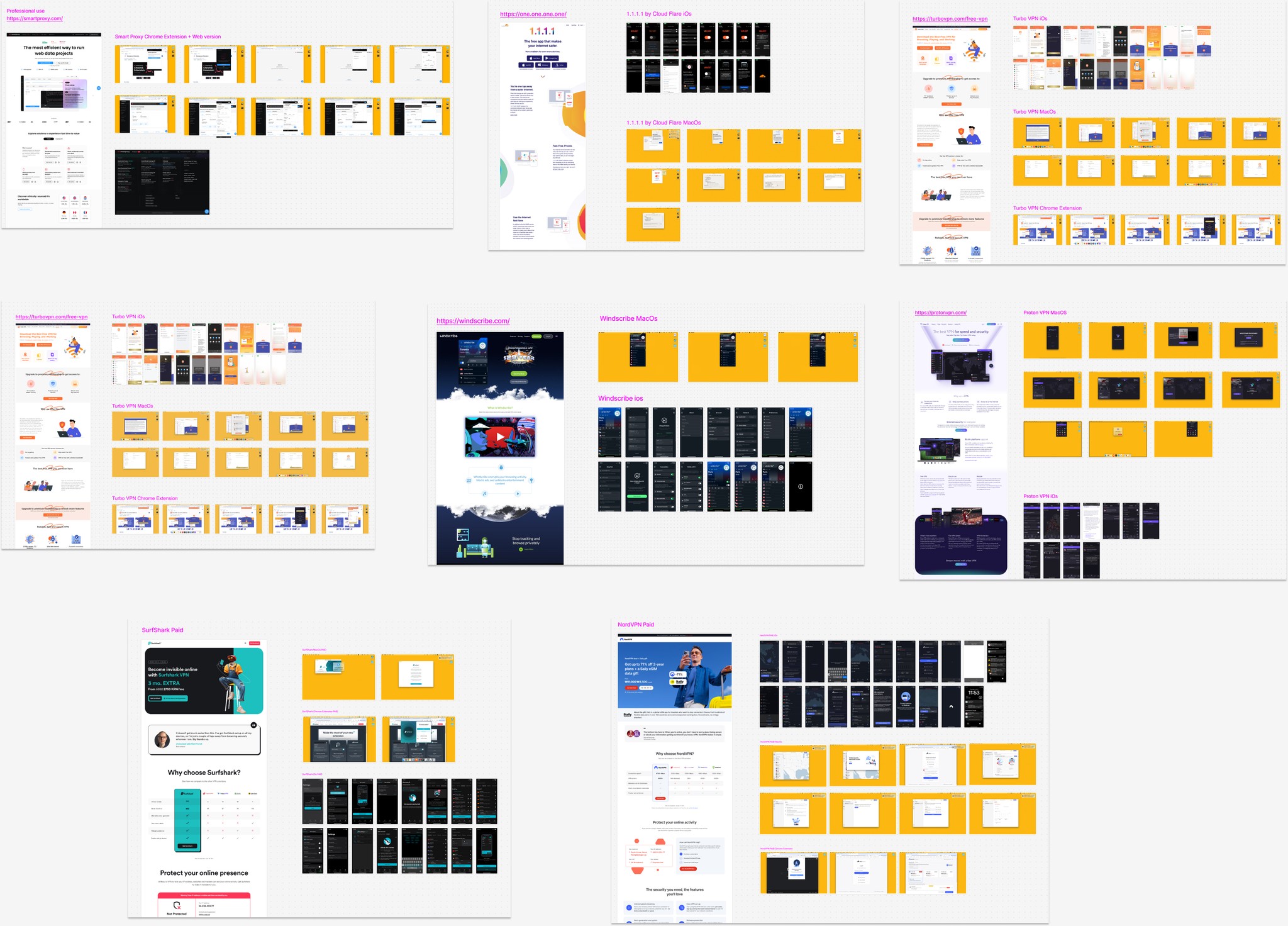
Competitive Landscape in FigJam
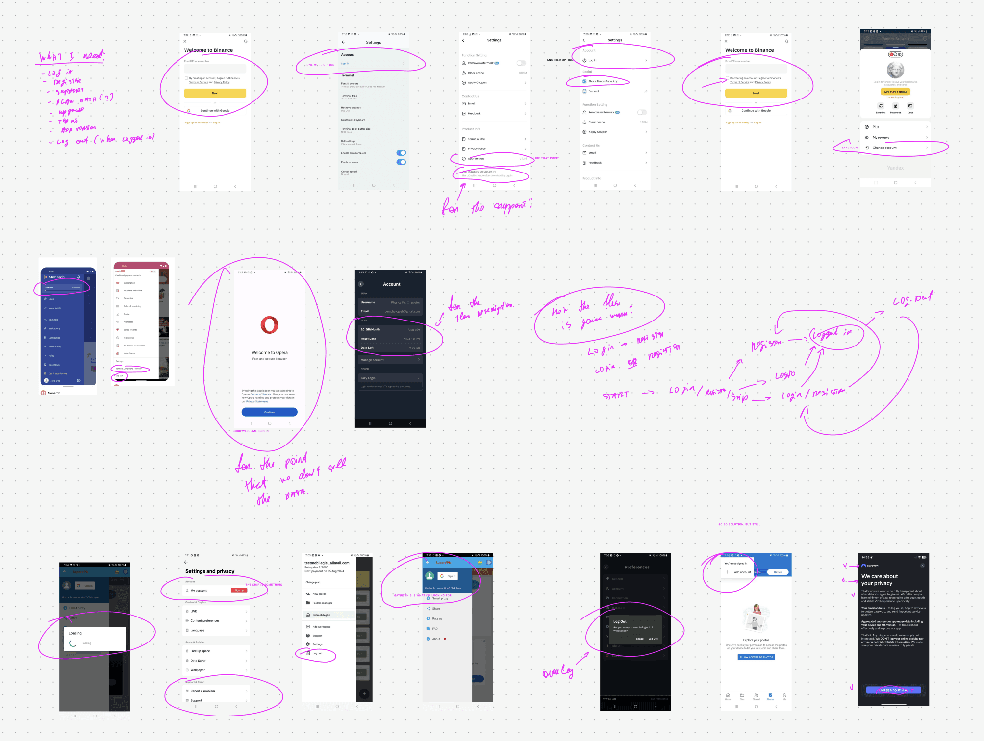
Competitor Analysis Notes
Conclusions
Ideate
Sketching Ideas
The key question is: 'How can we provide maximum value without extensive engineering to improve user experience and app economics?' The ideas are:
Conduct a step-by-step test of the pricing model until it aligns with competitors' levels.
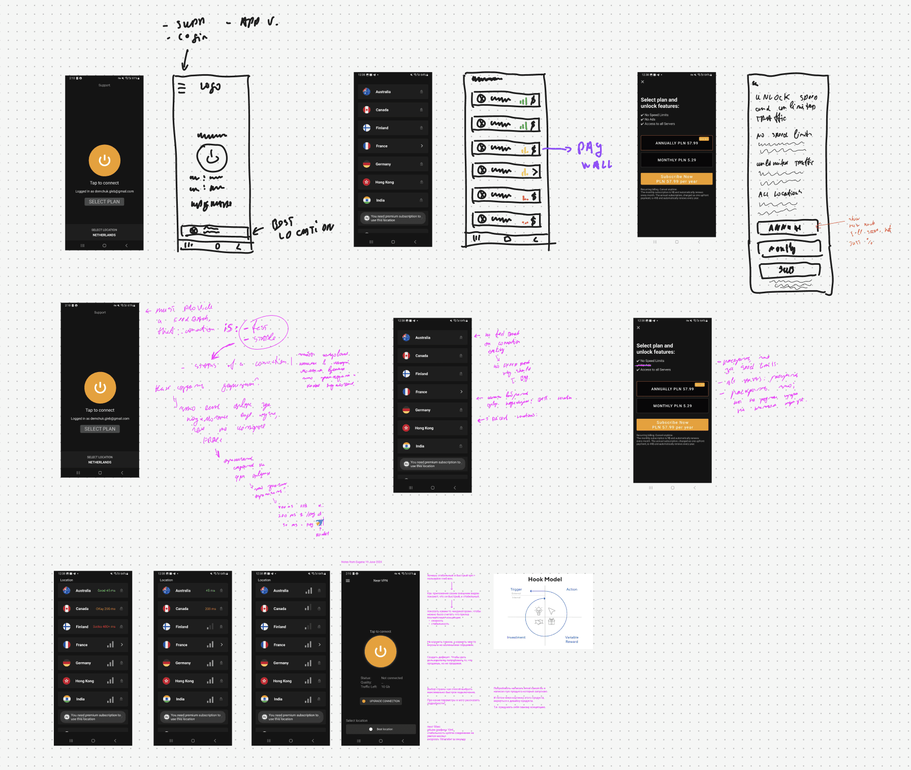
Prioritize Ideas
The simplest changes first, progressing to more complex adjustments that require greater investment from the development side.
Paywall
Start testing the pricing model
Change the registration flow
Add feedback on connection quality in the list of connections and on the main screen
Display the best connections on the main screen
Let's Design
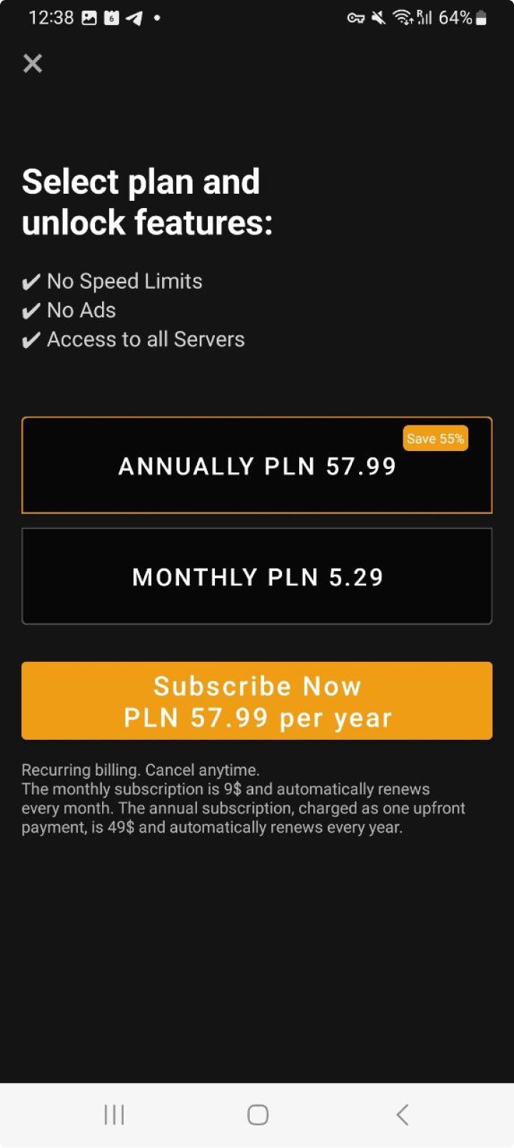
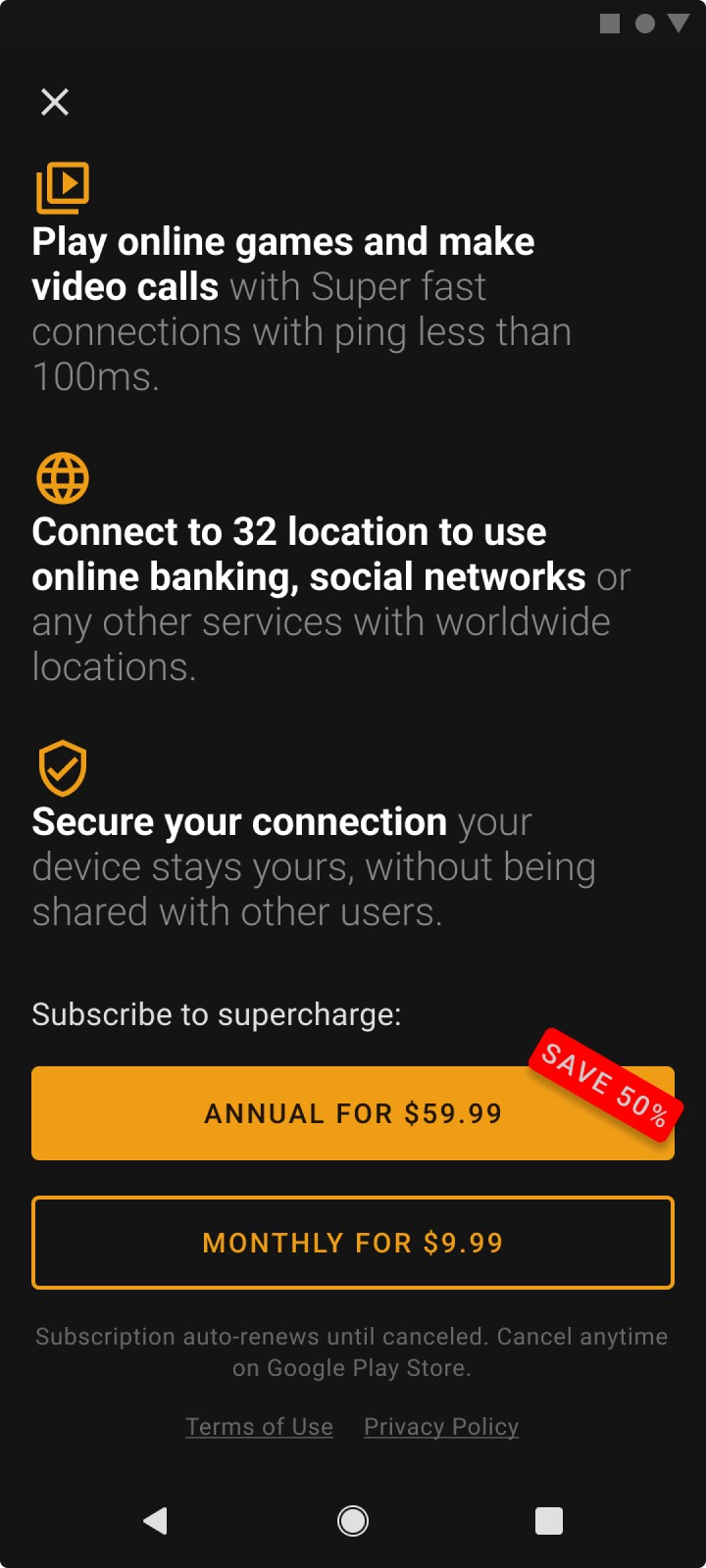
User Registration Flow
The registration flow includes a splash screen with the Terms of Service (ToS), informing users that on the free plan, their devices will be used as nodes for other users and may work in the background. The Play Store required to show that clearly for users.
Old
New
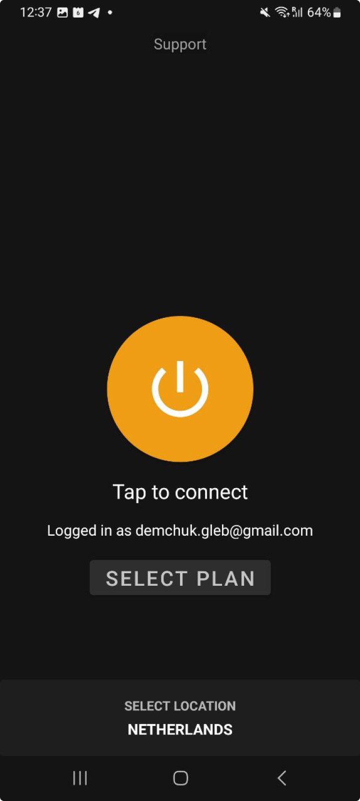
To define connection quality, I chose to display connection latency, as it is the simplest solution based on our current infrastructure. Showing users bandwidth speed requires significantly more investment, which is not feasible at this time. Old from the left Vs. New from the right.


Best Connection
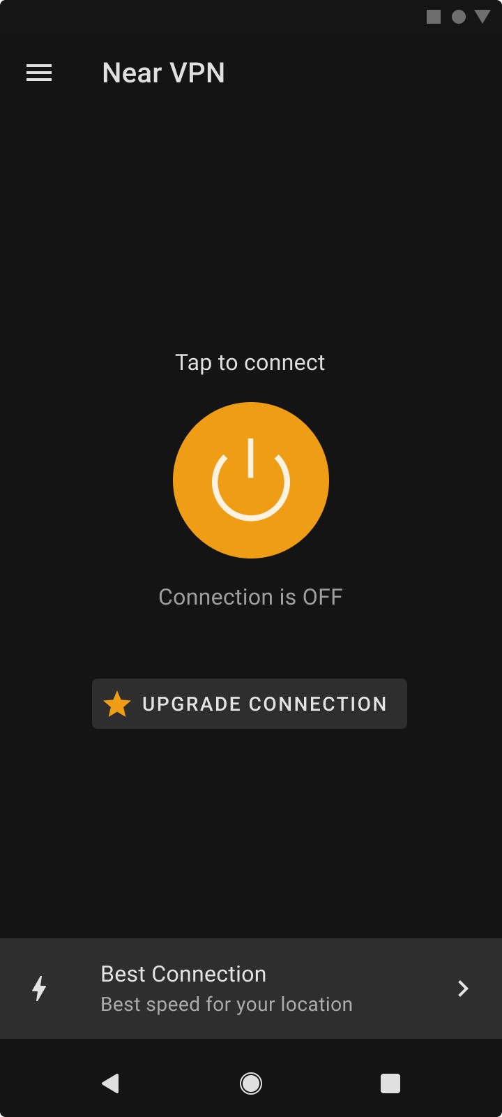
The logic for default connections is set to shift from a hardcoded location to an adaptive system that selects the best available server for users.
This approach aims to improve connection quality based on users' locations, eliminating the need for them to make a selection while still providing the option to do so if desired.
Old Select Location from the Left Vs. New Best Connection from the right.
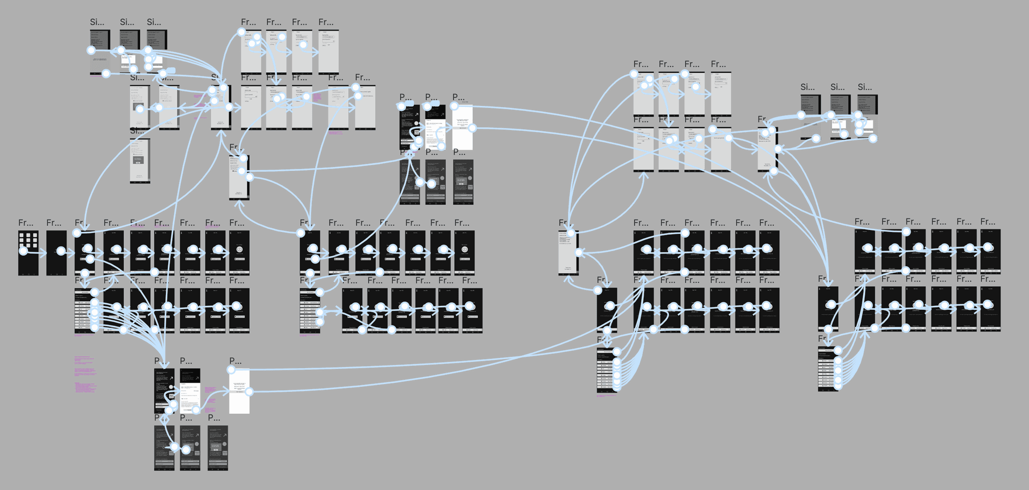
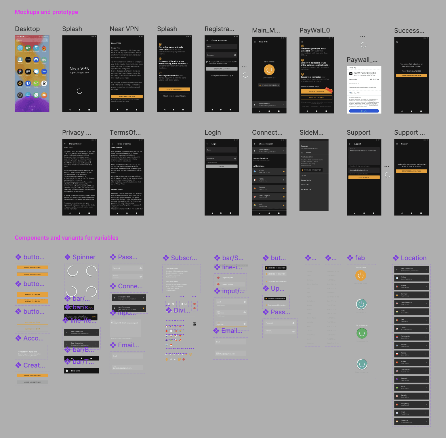
To minimize the size of the prototype, I applied conditional variables and components.
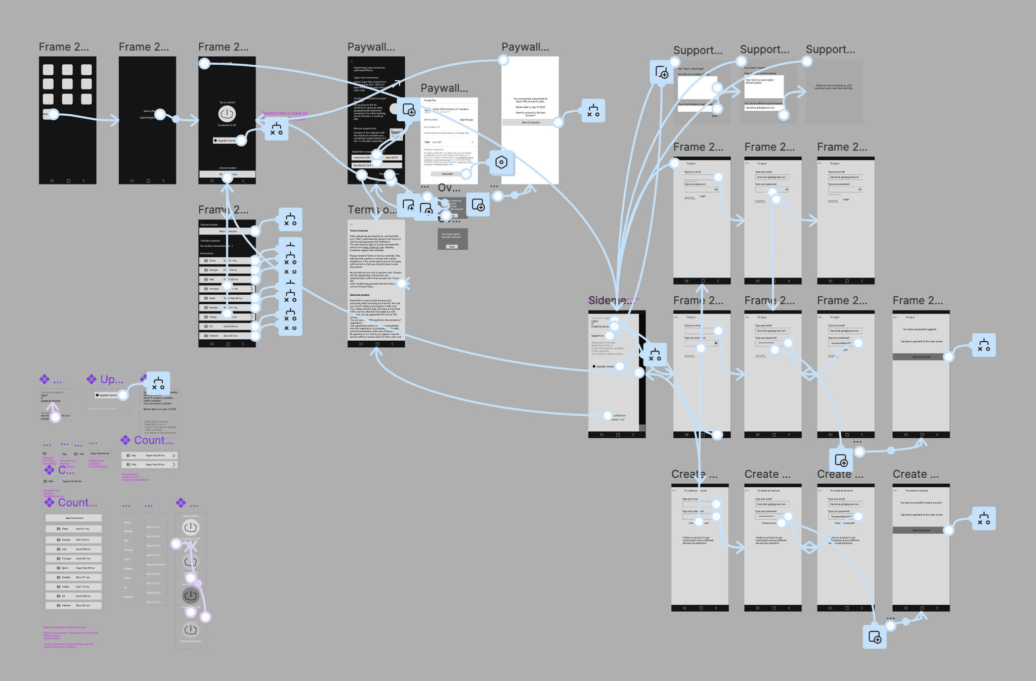
Mockups on Components
Mockups are based on custom-made components, styles, and components from Material Design 2. Links to Mockups and prototype in Figma.
Thank you for reading the case. Have a great day, and feel free to ask me anything!
That's it, so easy. 🎨 👨🏼🎨 🖼️
